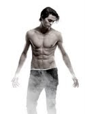
Recently I had the chance to review one of Egmont's newest releases, Blood by K.J. Wignall. You can read my 4 star review here. Recently I had the oppturnity to get some behind the scenes photos to share with each of you for the cover.
I'm also always intrigued how publishers and authors go about finding the "perfect" cover for their books. In this case, Blood's cover is a fabulous match for the story. Thank you to Egmont, we're able to share with you how they go about finding the "perfect" picture. I know what you're thinking, "Someone had a tough job with this shoot". *I'm not sure why the images loaded so small, please click on the images to make them bigger*

Egmont’s editorial staff had a great time creating the sexy- heart-throbby jacket image for BLOOD by K.J. Wignall. To start, Elizabeth Law, the publisher, talked to the jacket designer, Sammy Yuen, about what ideas he might have for showing the character of Will, a teenage vampire who was “created” in the 13th Century and Sammy had the idea of showing the vampire as he stalks the streets of London. As she recalled, there was some discussion of wardrobe, and of a long jacket that might be a possible choice for the model (Sterling) to wear. But when Elizabeth arrived at the photo shoot she was so dazzled by the sight of Sterling with his shirt off that all thought of trying additional wardrobe choices went out of her head. She wanted something where the character looked haunted, but also where he would clearly appeal to the readership. I’d say they nailed it!
What follows are paired shots from the photo shoot and Elizabeth’s commentary on the thought process behind each one.
Will has long hair in the book! But, frankly, we hated how the wig looked. We decided we could live with the error, that being immediately appealing was more important than being 100% accurate.
2. one-eyed view vs hair in the face


The single eye shots looked good in the studio, but when we tried them on the cover, we found it was a little forced looking—like he was acting, rather than natural. Also, we really hated the wig!
3. strike a pose poses


The first shot was too reminiscent of Taylor Lautner’s entrance in Twilight:Eclipse, and in the second I thought Will looked like a juvenile delinquent—not heir to the Earl of Mercia, which he was long ago, before he was attacked and became a vampire.
4. to fog and not to fog


I LOVED the fog. We tried shots with and without fog because we weren’t sure which would look better on the jacket. We ended up using a fog shot because it added to the “atmosphere” on the book jacket.
5. black fog and just black


It’s interesting, because the shots against black look really good—but the white background allowed the designer, Sammy Yuen, to lay in the London architecture into the finished background. Also, black made me think “vampire at night” which I find really clichéd.
6. full frontal versus over the shoulder look


There was quite a bit of discussion about over the shoulder—I thought those shots were very sexy. We are thinking of using an over the shoulder shot in the book’s sequel (due out next fall) called Alechmy


This is just awesome! How much fun would that have been to be a part of that shoot?!
ReplyDeleteHeather- I agree!
ReplyDeleteI've been wanting to read this one for a while now, so it's fun to see what went on behind the photo shoot.
ReplyDeleteCathy- It's a pretty good read. It's one I enjoyed. I've always been curious how on they find the right picture. It was great getting to see the inside scoop.
ReplyDeleteI kept telling him to pull up his pants--we didn't want the underwear showing, that didn't seem at all in character. In the end we photoshopped the underwear out by putting fog there in the final picture.
ReplyDelete